Vivi di Gusto
Carrefour Italia, part of the Carrefour Group, is present in 18 Italian regions and is one of the most widespread retailers in the territory. Innovation, convenience, services, and enhancement of the food and wine excellence of the Italian territory are its main strengths.
We were involved in identifying the best communicative role to give to the new magazine and making it a digital place to entertain, retain and convert the Brand’s Target Audience.
2021
Content
Creativity
Challenge
Giving value to valued products.
The project stems from Carrefour Italia’s desire to give more value to its products and importance to their selection, a strong feature of the Brand’s positioning and its clear differentiator from competitors.
From this inspiration, the digital version of the magazine Vivi di Gusto comes to life, and content creation can make the brand’s values and commitment perceived and known by its consumers.

Solution
An online guide to living with good taste.
We have transformed a print magazine into an online platform that can serve as a guide to what it means today to live with quality and good taste at the table and in life.
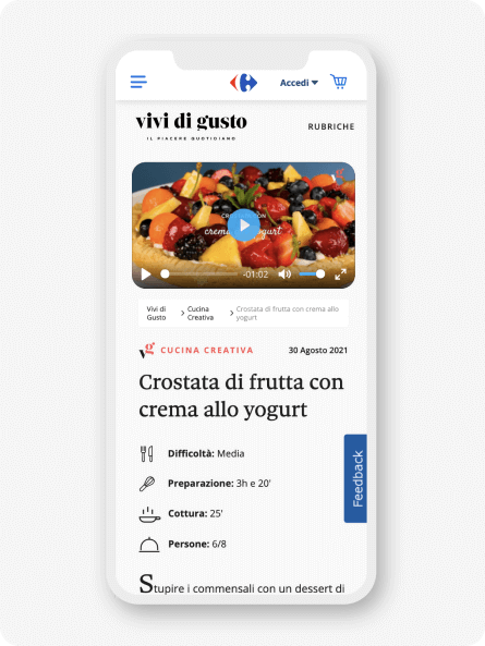
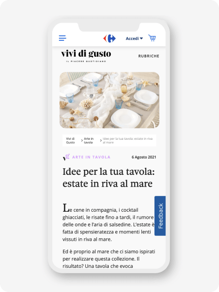
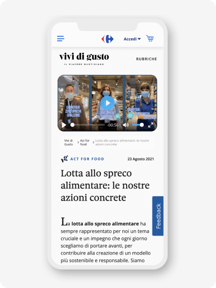
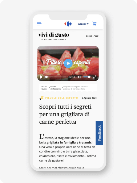
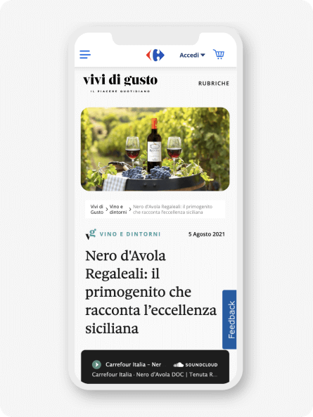
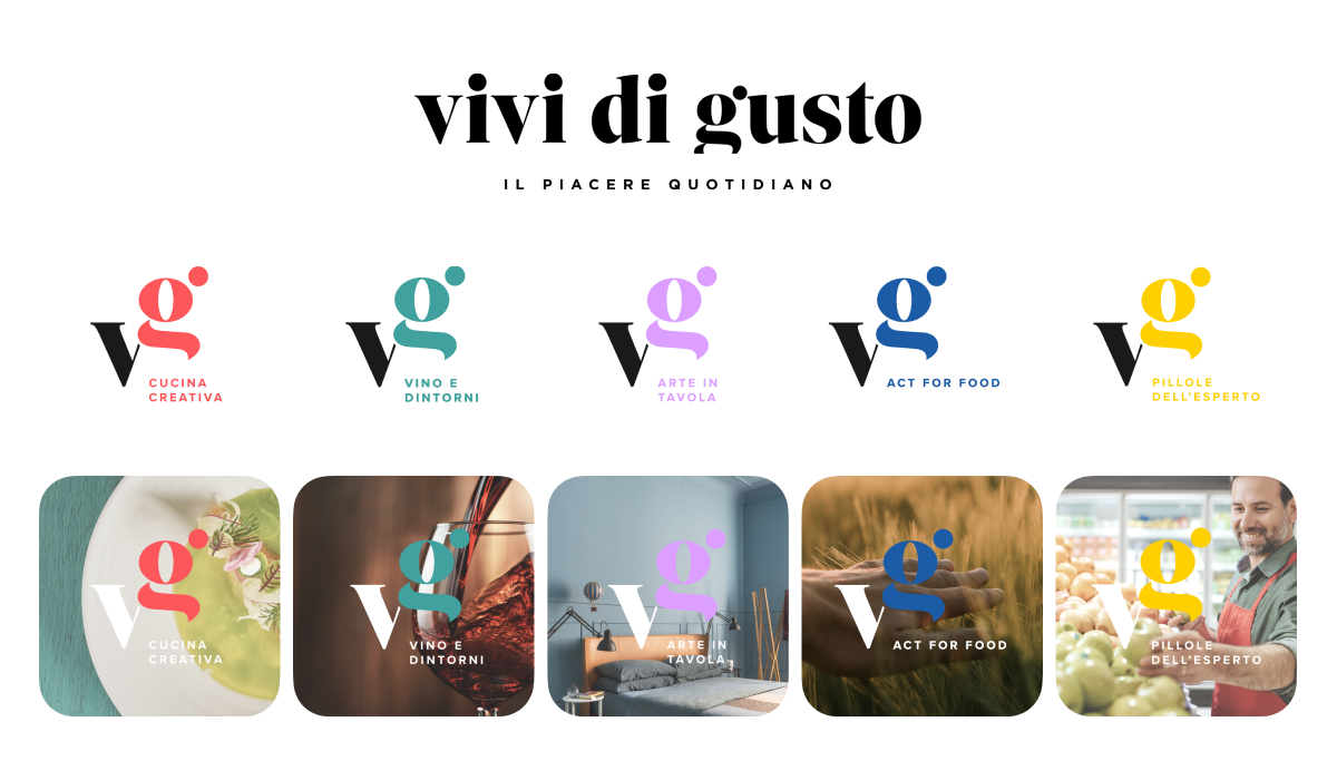
We did this by creating and structuring 5 editorial formats, each one dedicated to a different way of living with taste: video recipes to learn how to put more creativity into your dishes, mise en place tips, tips on choosing the best ingredients, podcasts to learn the secrets of many wines, all the way to videos and articles that tell the brand’s commitment to a more sustainable world.
Execution
A new identity.
For the new look&feel of the magazine, we chose a modern, fresh, and sophisticated style with reference to the world of publishing. Thus, from a refined but at the same time classic typography originates the logotype flanked by the original payoff of the magazine.
To give it even more character and recognizability, a monogram composed of the crasis of the letters V and G was created. The latter declined in the 5 colors of the headings, which helps make each content published by the magazine even more recognizable on the different touchpoints.
A Content Centered Design.
Not just new content but real formats geared toward engagement and user needs telling in a fluid and dynamic way thanks to user experience design designed to enhance content by making it instantly recognizable on every device.