Easier. Better. Gleater
“mymenu” is the brainchild of a team of young entrepreneurs with a strong passion for digital and food. In 2021, the startup decided to launch a new service called Mybistrot, a service that leans on Pellegrini canteens and offers healty menus with weekly subscriptions for smart or office workers.
2022
Integrated Marketing
Challenge
Work lunch that improves the day and also life.
Mybistrot is a service dedicated to companies that aims to improve the lunch experience for employees at work.
Following the acquisition by the Pellegrini Group, we were asked to make Mybistrot more than just a simple reservation service and to make it independent from the mymenu mother brand.

Solution
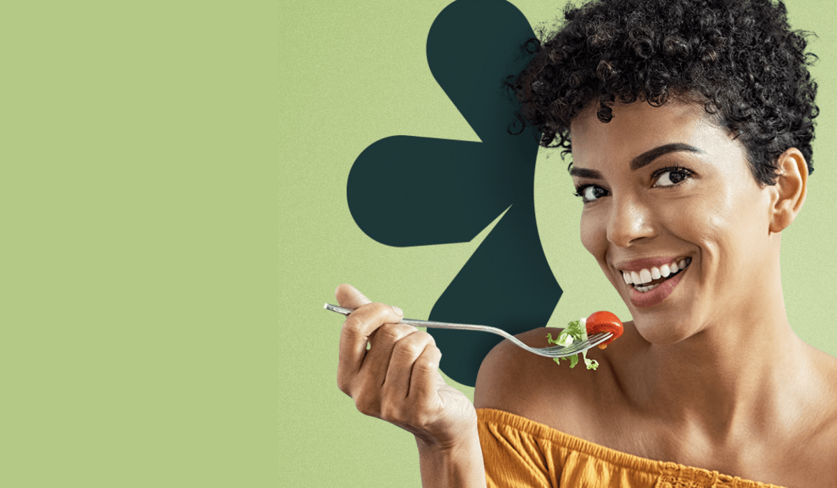
A new taste experience. Healthy, simple.
With the creation of a new coordinated image, we have renewed Mybistrot in every aspect of communication to create something distinctive that can be a reference point in the daily routine of employees and stakeholders.
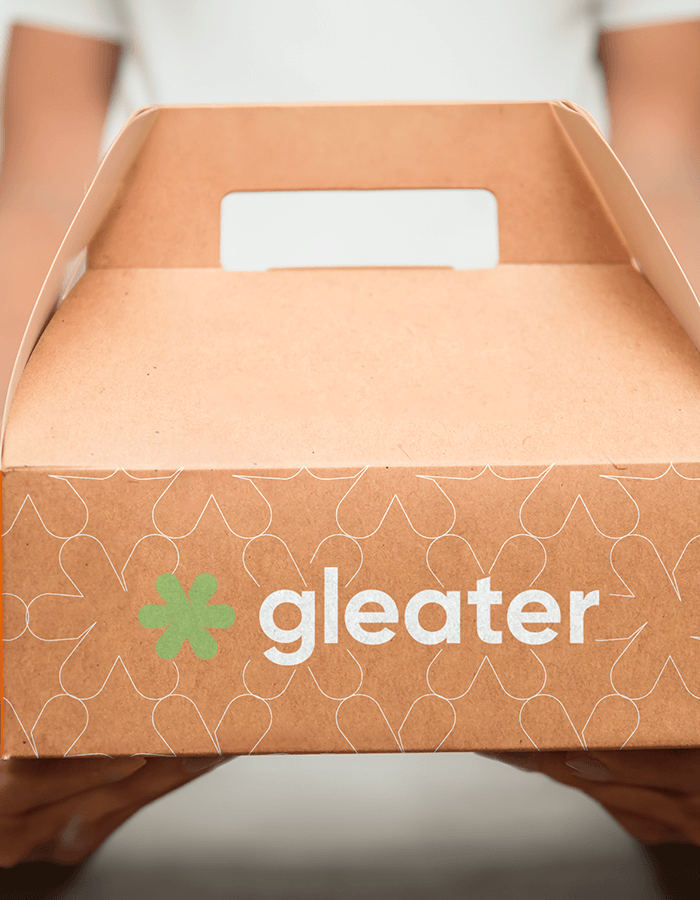
And so GLEATER was born.
Execution
Il naming.
GLEATER is the perfect synthesis of all the main values of the mymenu mother brand.
It is a name that combines freshness and brightness (GLITTER) with the pleasure of eating (EAT) something different from the usual, good and healthy every day.
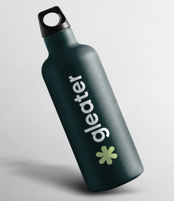
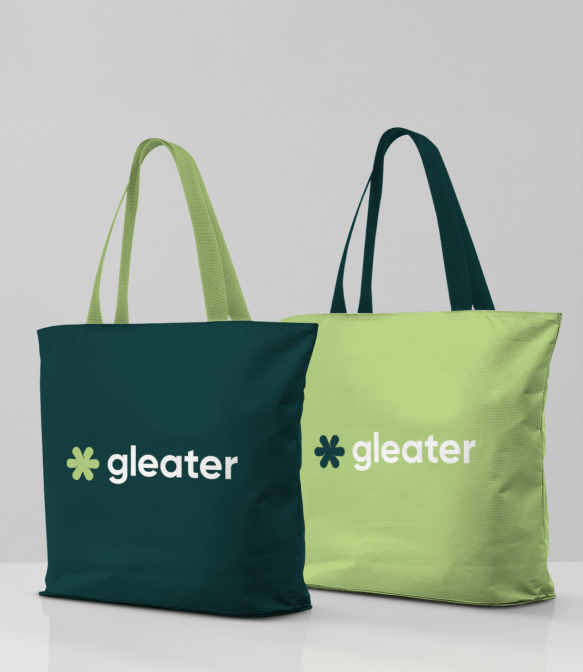
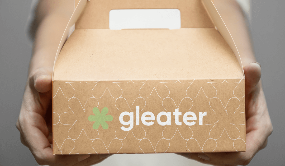
The logo is based on an original symbol, starting from the abstraction of the figure of glitter, we arrived at the essential element: an asterisk.
Execution
The graphic symbol.
The asterisk has been reworked into a softer form, whose cuts refer to an overlap, capable of bringing out the facets of the brand and therefore encapsulating the brand’s values.
It is a harmonious, multifaceted shape that recalls the balance given by the brand’s services and their variety.
In addition, in recent years, it has become a sign of inclusivity, used for gender-neutral communication.